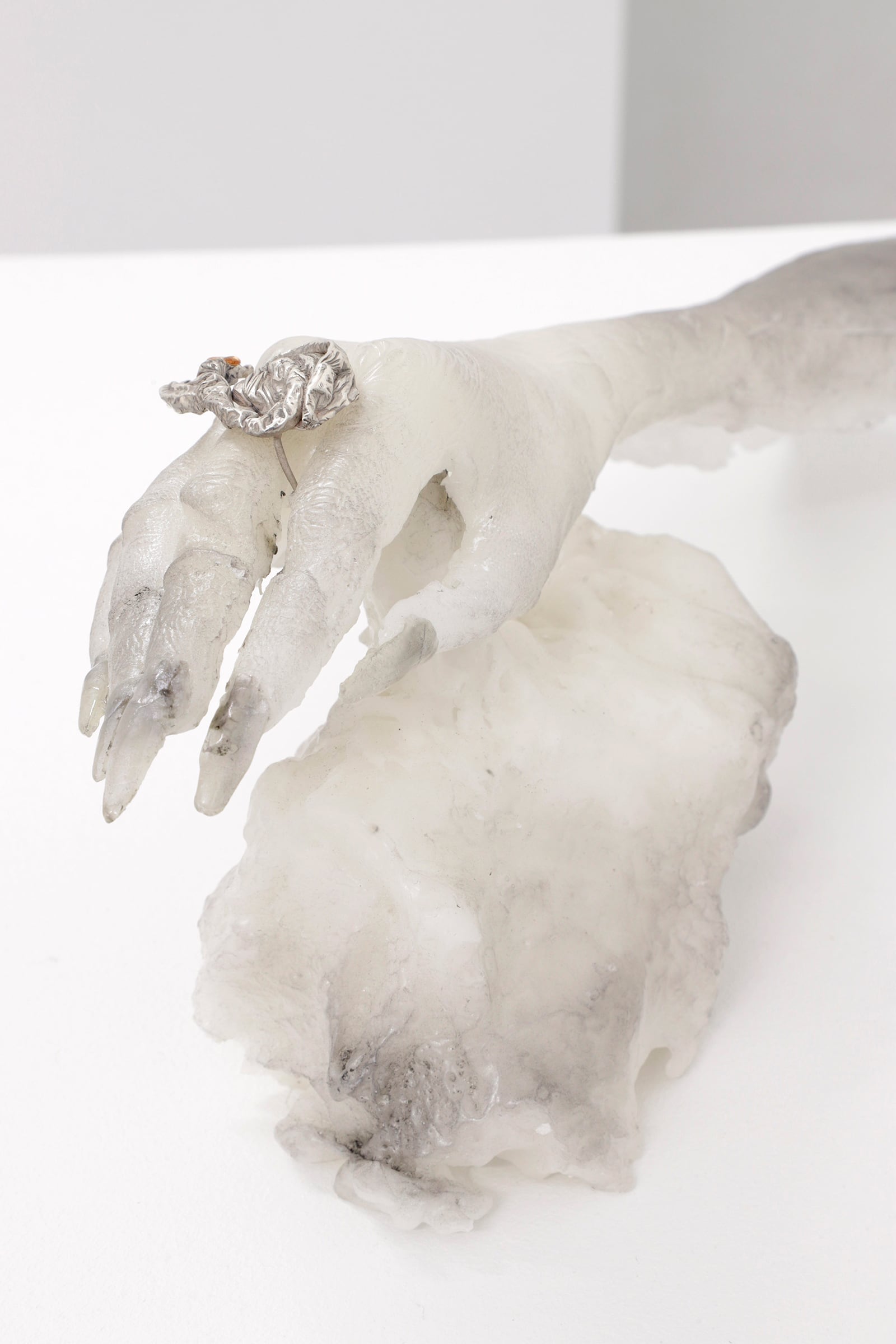
 Shadow Banned, courtesy Plague Space
Gengar is a character in the Pokemon trading card game, video game, and television series who is notable for its ability to hide in shadows and infiltrate dreams. A player can evolve a Gengar from a Haunter only through trading it back and forth with a friend. This requires trust, since the friend could easily disconnect and keep the Gengar for themselves. Trust and trading are important, though often unseen, features of art, and often change its meaning, value, and experience. A painting bought at an auction and transported in a wooden crate by way of freight ship is different from a painting handed over in exchange for a bag of potatoes. In shipping the work to Krasnodar, the direct path from the U.S. to Russia is impossible due to trade sanctions. Instead, a German shipping depot acts as fiduciary before they are sent to their destination.
Michael Bussell repeats and refigures Gengar throughout an unnamed series to create shifting yet fluent images that recall comic book covers, animation, signatures, fan art, and portraiture. The series has the feeling of individual devotion as it is both strictly unified but also versatile in its usage of a broad range of drawing techniques and vernaculars to experiment at the limits of repetition and figure.
This interview proceeded during the opening week of his first solo show at Plague Space, Shadow Banned. We talked on two separate nights over a telecommunications application and processed the audio file through an AI voice to text utility before editing the interview into its current form.
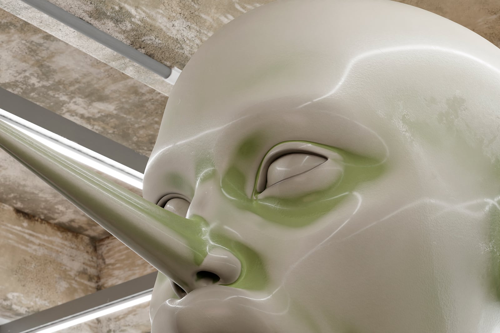
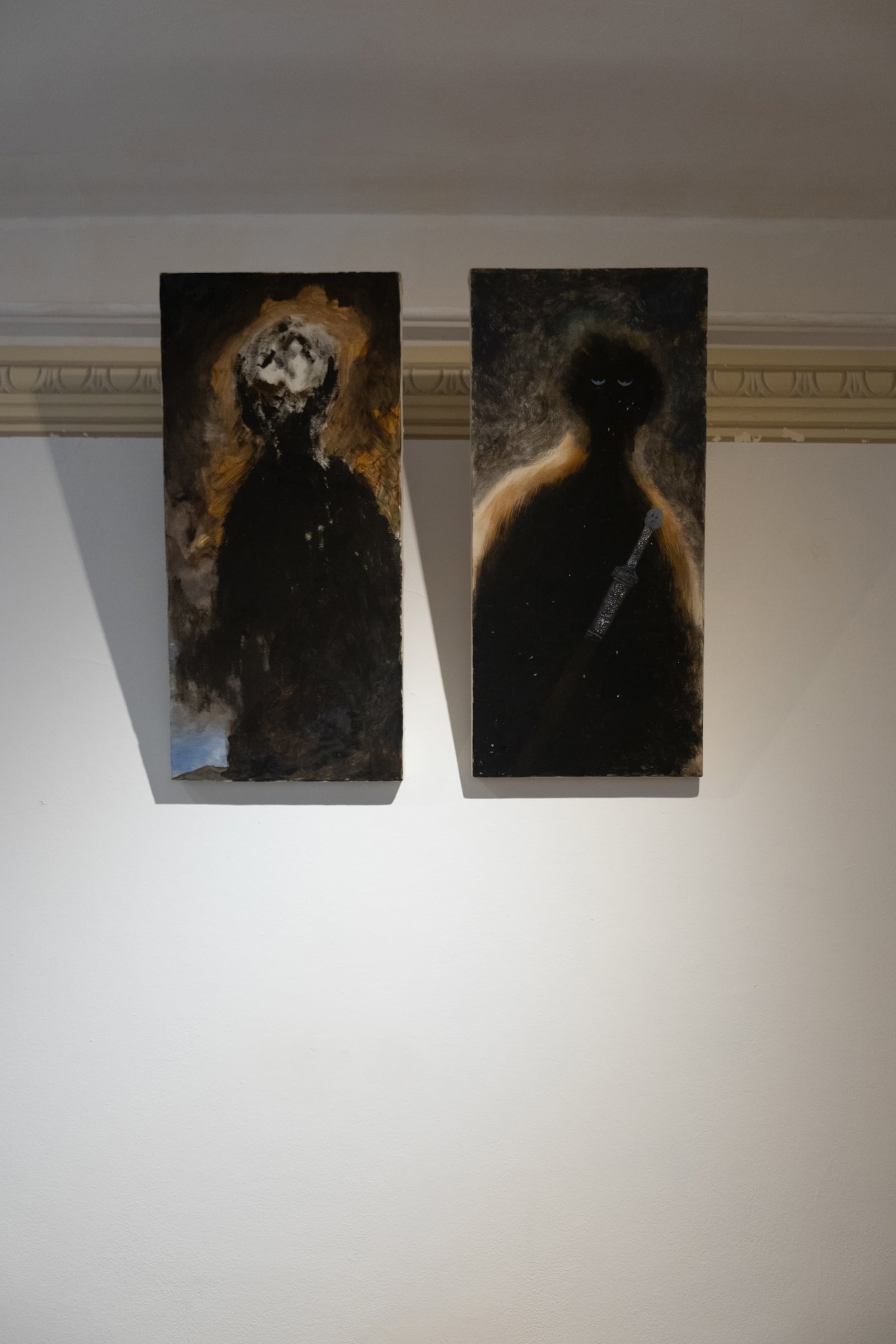
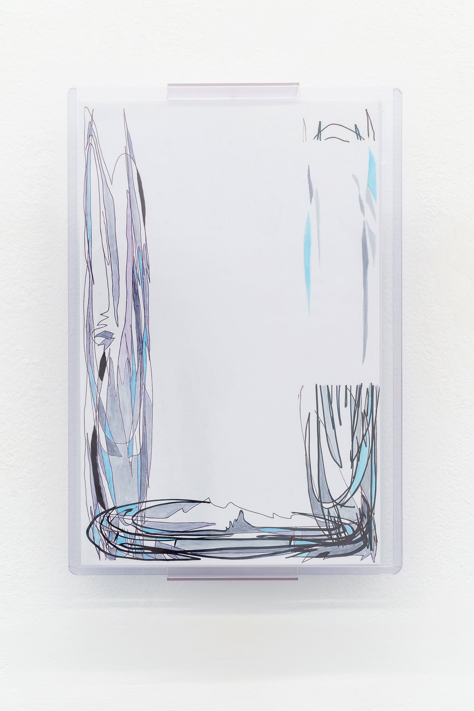
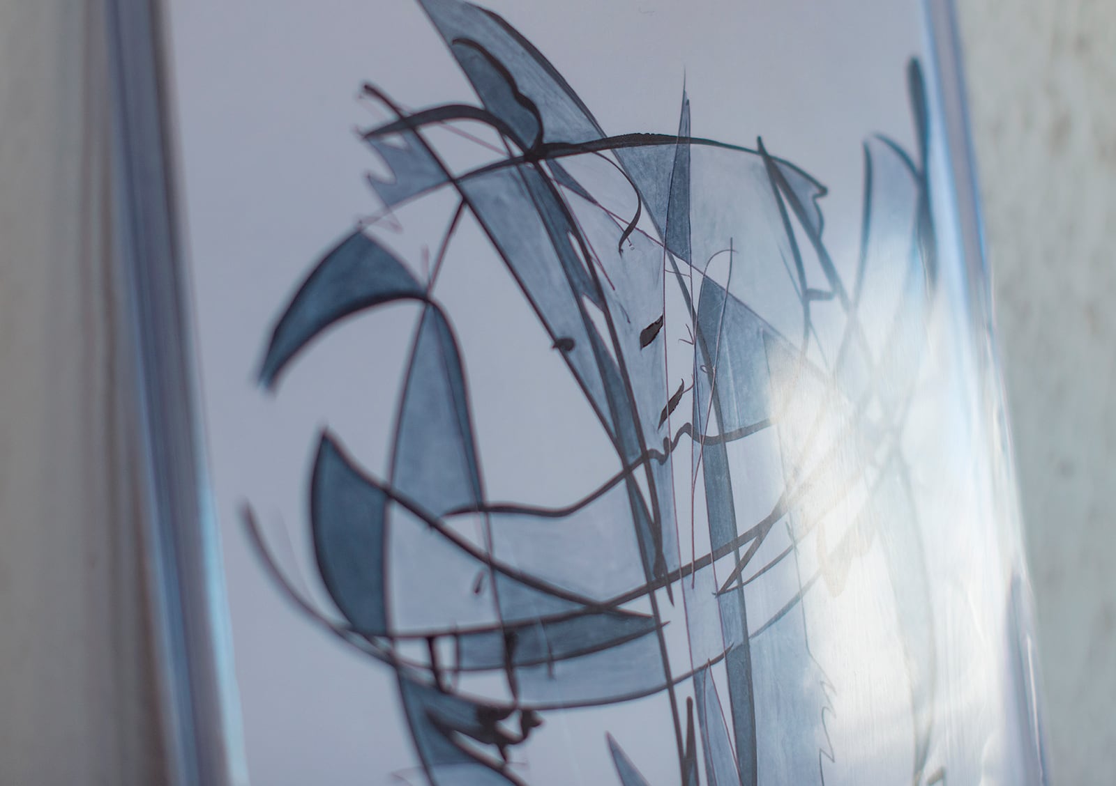
#111, courtesy Plague Space
#113, courtesy Plague Space
#94, courtesy Plague Space
Anastasios Karnazes: I am looking at two of your pieces I have on my wall right now. They are from the same series on view at Plague Space. The room I am in has no windows, so I’ve set up a bunch of weird lighting. The way it’s reflecting off the glossy paper and the plastic toploader reminds me of stained glass. I realize for the first time that the outlining and coloring of cells mixed with the glossy surface have this similar effect.
Michael Bussell: Yeah, it’s not like I’m thinking about it while making it, but I was lucky to have the experience of making a very small piece of stained glass as a young kid in an interesting art class. It was this artist’s studio and classroom space that would horror vacui fill all the walls with past students’ work. You could go around and say I want to make that, and there were the facilities to do it.
There are not many formal connections, but the use of a heavy, dark outline is there for stained glass even if the way it interacts with light is different. There’s clarity of the image, and how it is competing with all the reflections and distortions built into it from the plastic bag, and then the top loader.
That’s part of the connection to these other art forms, including comic books, that have a very utilitarian function insofar as they’re trying to describe specific things and have a connective tissue of clarity in the understanding that they’re going to be competing with a distracted and distorted experience in the world.
 Shadow Banned, courtesy Plague Space
Anastasios Karnazes: Earlier you brought up having a rule list somewhere. Can I demand you tell me the rules?
Michael Bussell: It is a physical note that I typically leave out on my desk. I think of it more as a to-do, because I use that same notebook also just in life for writing lists etc.
So, it functions more like a note to myself, meant to remind me of day-to-day affairs, but also of my intentions with the drawings. There’s the limitation where all marks must be permanent. No pencils, it’s only ink. The reductive actions then become covering the image or cutting the board itself to rearrange it, which doesn’t even really erase it. The only kind of erasure that’s possible is a kind of further distortion, or more commonly, obfuscation with another element, either by rearranging the ground itself after the fact, or covering it with paper or sticker paper.
I typically don’t work back into the line work after that phase is done. Rarely do I go back in and add lines after closing that door. Though it isn’t impossible. I think the idea of calling them rules… It’s more noticing the frequency with which things occur, and the overall population of the body of work–a way of engineering what’s common within it or not, and by extension emphasizing things that appear scarcely as more themselves for existing in this population, setting up expectations and being able to defy them or not within the series of images.
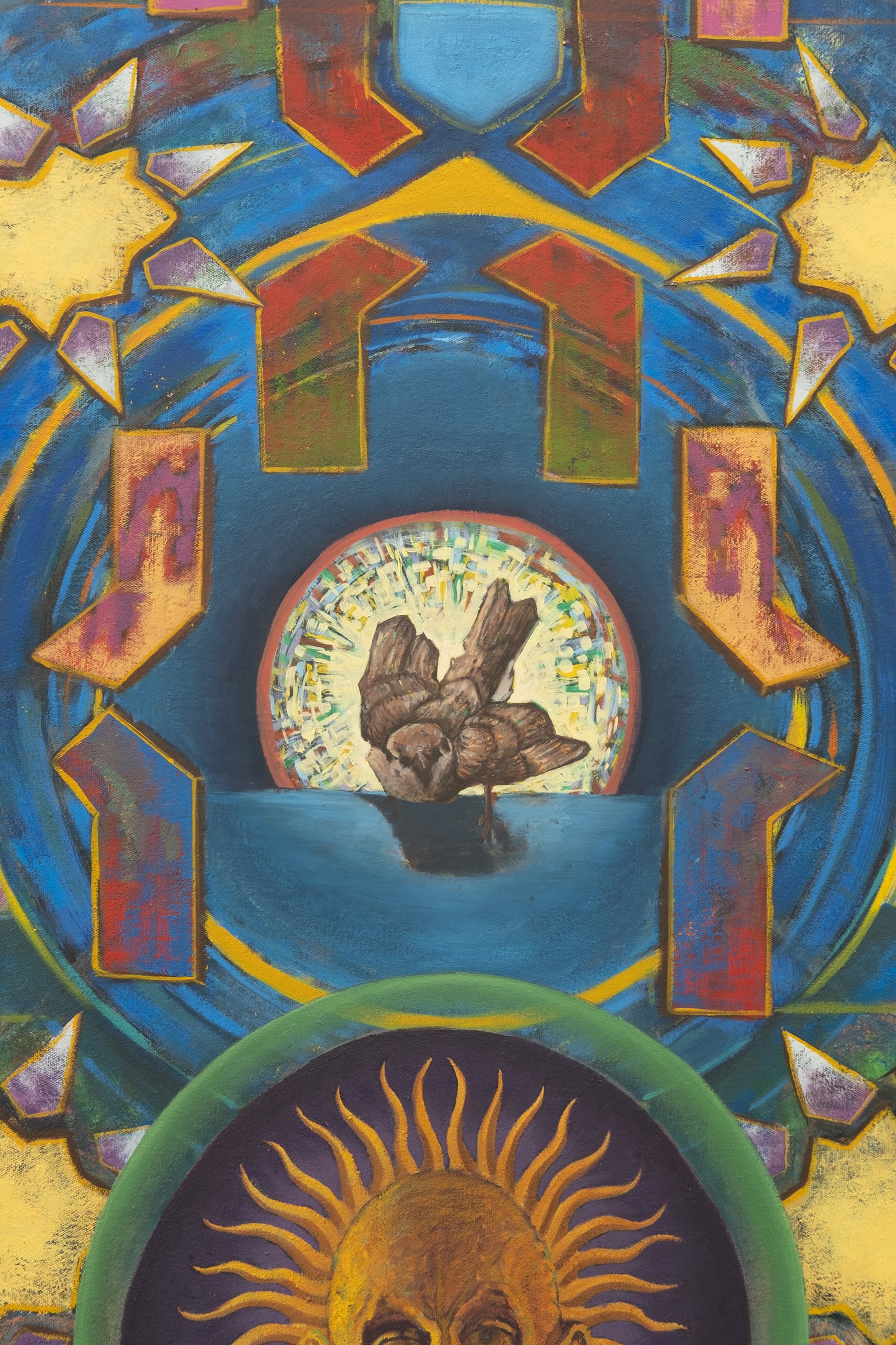
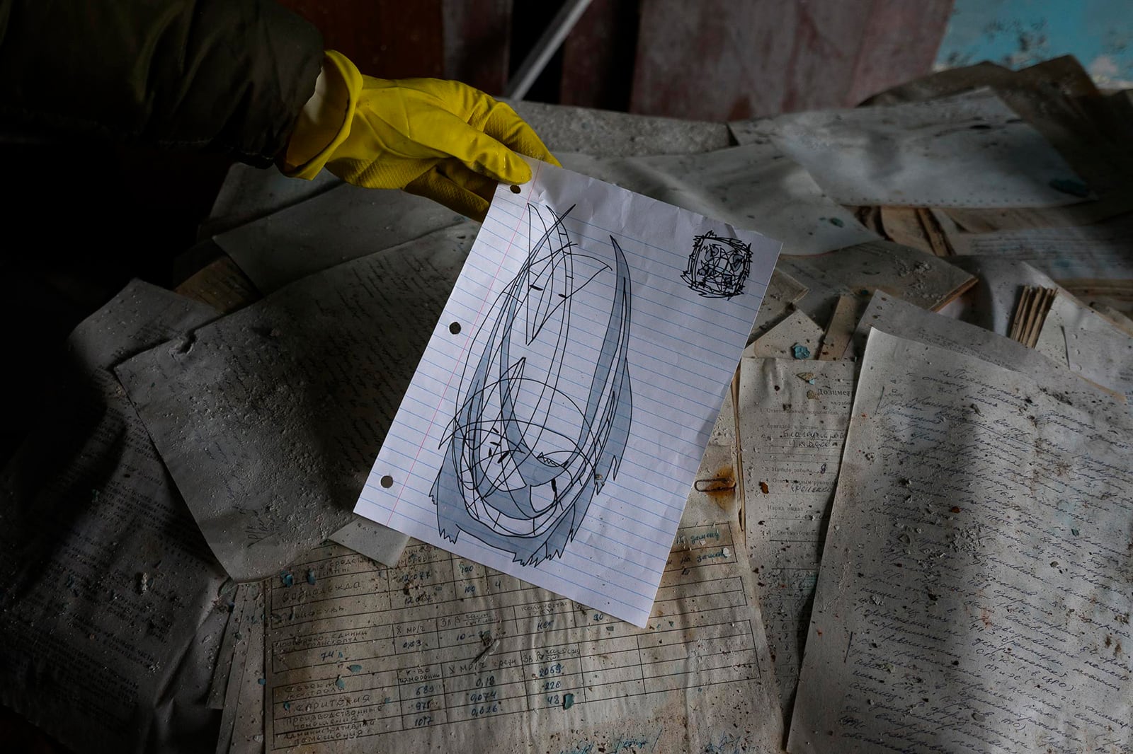
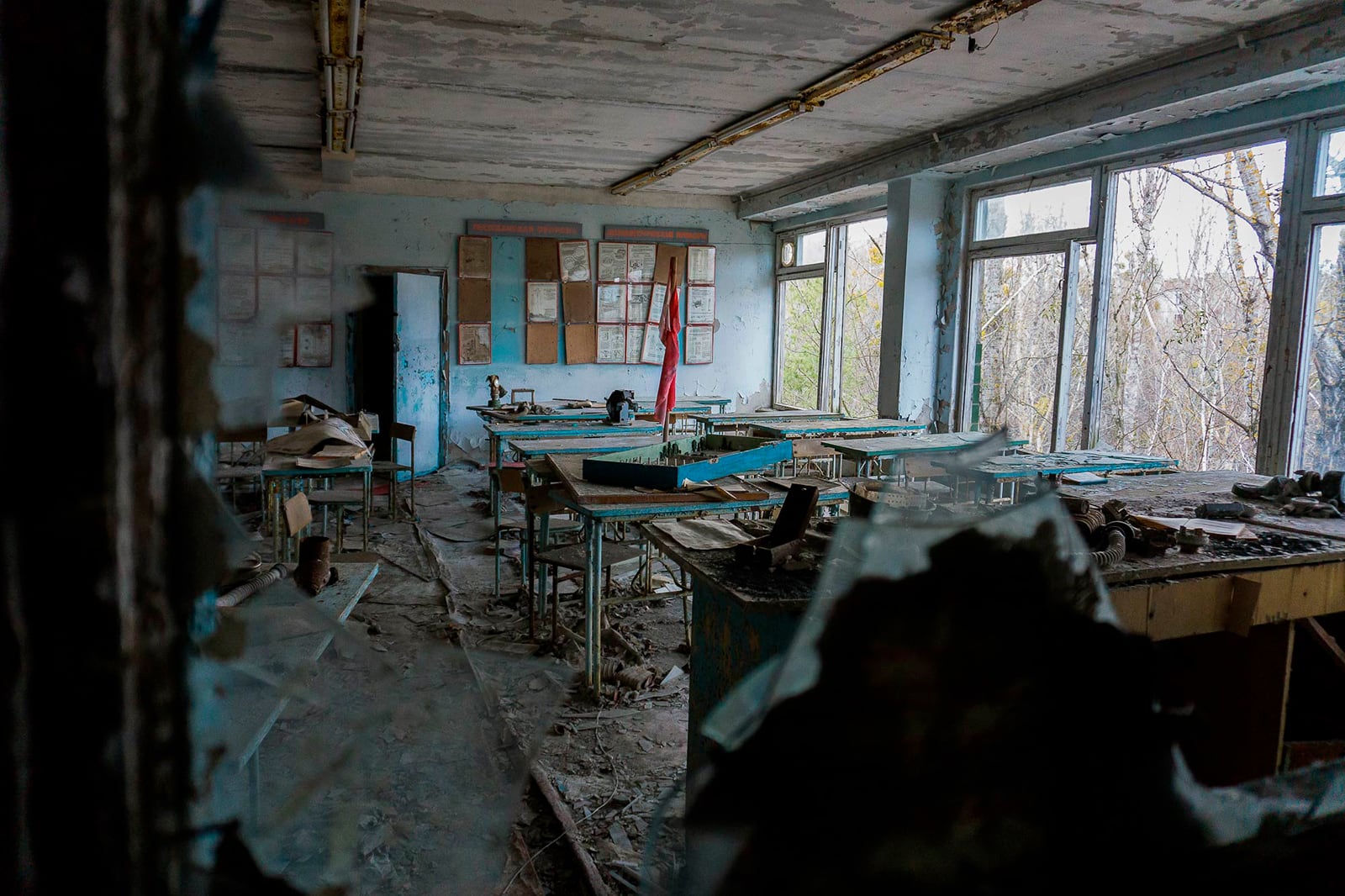 Chernobyl Papers, courtesy New Scenario
Anastasios Karnazes: I like that they are mixed in with the more general notes about your everyday life. A serial project mixes with the life of the artist and the viewer/collector in an interesting way, since its more about accretion than the experience of any particular piece, the way collecting a run of comics can span years and decades. The context of your reminders mirrors this blur between life and artwork.
Michael Bussell: Yeah, I’m just looking at it now. The only other thing I missed is, I wrote live ink, which is another part of only permanent marks. But that term comes from signature authentication. I just love that term mostly. It refers to the performative element of doing a signature and being able to see the life of that mark, as opposed to a recreation of it. And even then, part of what I enjoy about working in the scale is that I do photograph them as objects for documentation, but more so I’m able to scan them quite easily and exaggerate the scale far beyond the real size. Looking at them by way of scanner is very similar to how a signature is authenticated too, which is done with extreme amounts of light, extreme magnification, and image resolution. It’s cool to have that experience in cataloging them as well when I think about the lines. Certainly, it captures everything else, but for me, the colored-in parts refer more to painting. They vary from flat to looking more like watercolor if there’s a particular kind of pooling of the alcohol. There’s something very basic there about coloring, how we first learn about shape and color in coloring books, the most basic relationship one has with drawing, having markers and coloring lines and coloring in those lines.
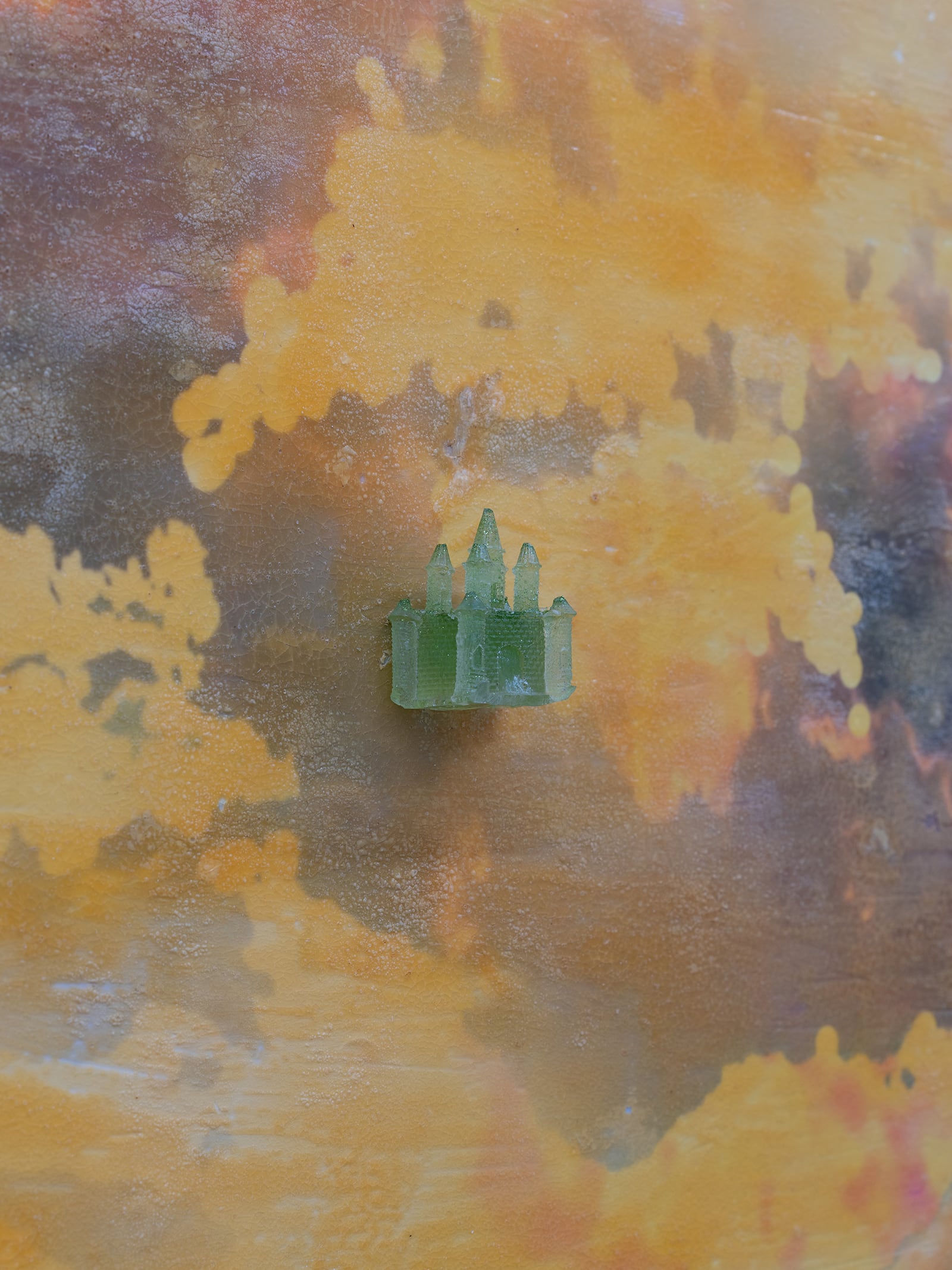
#118, courtesy Plague Space
#89, courtesy Plague Space
Anastasios Karnazes: While we talk about color, I have to mention that Gengar’s shiny sprite is notably underwhelming. [A Shiny Pokémon is a specific
Pokémon with different coloration to what is usual for its species. It is one of the many differences that a Pokémon can have within its species.] Where most shinies differ by leaps around the spectrum, the difference with Gengar is between purple and less-saturated purple… Part of your work for me is servicing the tragedy, like how a fanfic can bring a fantasy into realization. You have no problem straying from the canonical palette.
Michael Bussell: I really like that view of it. I’ve certainly done drawings that have no color in common with the original. There’s a lot of pieces in the show with fairly original types of characters, because at a certain point the distortion of the original figure can just turn into its own thing. I’m not pressured to link the drawing to the source, as much as I think about them in sequence. Often, I’ll have had some intention, and it went its own way, which is cool. But there’s a seed of what I was hoping it would turn into that I want to revisit later on. In that way, it’s how a comic creator works. Not at all to make a comparison to the rapidity and simplicity of my images to the complexity of making a narrative, the intense work of depicting reality, laying out a page, and writing dialogue, but just the sense of the malleability of a character, thinking through the possibilities of how many places this can go, and the arc over the course of many issues. Having that flexibility where the work can be done in a million different iterations and be looked at, recombined, and reimagined in so many ways, yet still have it sort of be part of the same universe.
To speak to the color, they all started as black and white, and just like gray. I did a lot of drawings for myself with the same markers, which are alcohol based markers that are commonly used in different types of illustrative arts. I associate them with fan art. I appreciated their consistency, the way that the ink flowed, and the ease of use. And if I do start to run out of ink, they’re alcohol based, so I can just dunk it in isopropyl alcohol and essentially revive it. Eventually I started introducing colors as an element to interact with the gray. Over time, I started to see less reason to exclude colors as a rule, though it’s still a somewhat limited palette, and I’m not in a rush to cover area. They do in some way reference the colors of Gengar and that is good enough for me.
Still, there are some where the references to Gengar are very obscured by the distortions of the drawing, and I think of these extreme iterations where it’s almost a different character altogether as relating to comic books in the way the different characters or villains in a series all share the same kind of design language. There is a lock Gengar that I had drawn on a notebook in the way a journal would have a literal lock on it. I was drawing it for myself and thinking this seals my to do list with some intention instead of it just being loose paper. Those become different characters but also different reflections of the same idea of the character.
The best example for me is a series of Spider-Man covers which are now highly collectible. Perhaps that’s why I think of them. But they’re collectible because they inaugurate the turn into the black suit and the introduction of this villain version of Spider-Man, the Venom symbiote, and of the character Venom, who now in the film franchise they’ve turned into a morally neutral character.
The fascination with constantly having new characters and new versions of them in comic books is that feeling of identification where it’s not really a portrait, it’s this image of an idea of a person or character. With the scale of my work, about the size of a face, and hanging at face height, it gives the experience of being face to face with a character or an individual. They certainly share some qualities across the series, but they are all meant to be unique. And often there are a pair of eyes or multiple pairs of eyes looking at you or in your direction. And even if not, there’s still that relationship of circular shapes within a square frame that is about the size of a human face looking at you.
 Chernobyl Papers, courtesy New Scenario
Anastasios Karnazes: I find I typically am trying to figure out where the eyes are first, I get grounded in the image, and then I look for other limbs or just swirl my vision around.
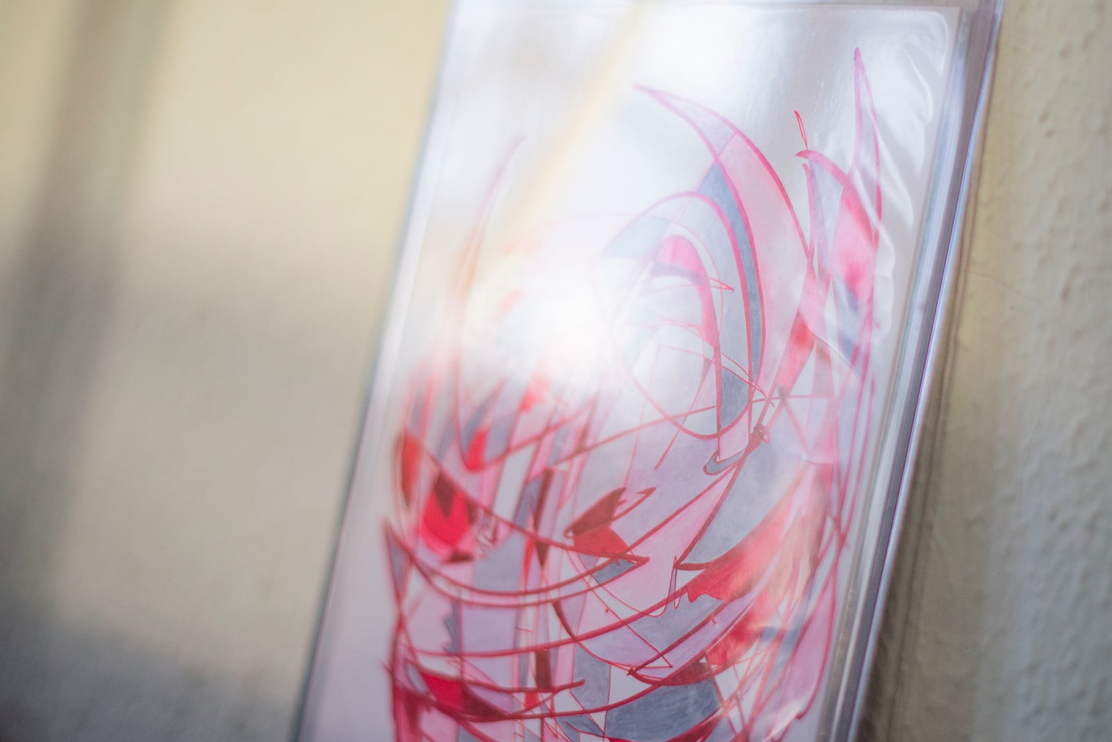
Michael Bussell: There’s a scientific principle for this phenomenon called pareidolia, where we are hardwired to look for faces in things even if they don’t really look like a face. That’s one of the first things that I considered making images, what am I doing with the eyes? The red piece, #111, started with the eyes, sat for what felt like a very long time and was very unresolved. I was happy with it but knew it wasn’t finished and really didn’t want to mess it up.
 #49, courtesy Plague Space
Anastasios Karnazes: The thicker lines on the red one feel wilder than most. It disturbs the smoothness of the face, feels scrappier and angrier at the same time.
Michael Bussell: It is unusual in the series for that to happen with the thicker line. I do a lot of drawings on paper that have things in common content-wise with this series but that are not part of it. They have a lighter and gnarlier hand, and I was wondering how I could bring that looseness to the series. The impulse was to try and be gestural with something that ultimately can’t be that gestural, because it’s very small in scale. I can’t make a full body movement. But I wanted to bring the energy of that kind of movement to the series. I found it in these scrappier drawings and thought, how can I bring that freedom into something that I do have longer term intentions for? Even within the drawing itself, because I also know that it’s ultimately going to interact with lines going in different directions and it’s going to be an armature for building the color and finishing the completed experience of this image. So #111 was a cool development in that sense.
 Chernobyl Papers, courtesy New Scenario
Anastasios Karnazes: One thing I always return to in your work is the question of how far an image can distort until it drifts into unrecognition. In this case, the jerky line is pushing what a character’s line could be like. It would be hard to imagine a traditional cartoon having lines that retain that much gesture. The impetus for cartoon production is to keep bodies smooth and regular except under special circumstances, like after a stick of dynamite explodes in a character’s hand, and all that’s left are crispy whiskers on an ashen heap. Similarly, the one that looks squashed into a corner also helped me sort this out because it is a physical enactment of the image being smushed and flattened against the limit of its frame.
Michael Bussell: There is some relationship here to what comic artists do in making dynamic images, not that I think of my work as doing the same. But comic artists do have specific techniques for depicting depth, foreshortening and a myriad of other ways to make the two-dimensional plane stretch and expand. There’s still a lot of uncovered ground there for me.
 Studio view, courtesy Michael Bussell
 Studio view, courtesy Michael Bussell
Anastasios Karnazes: I like your usage of the world “cell” in this regard too. I would naturally imagine a cell as a colored section inside a closed outline, but there are also “cels” in the sense of the animation cel, as in celluloid, which gets back to the stained glass idea. I can use both definitions to look at your work and begin to view your iterations within a timeline as opposed to a frozen frame.
Michael Bussell: They are representing motion or moments in time. Like a bunch of animation frames stacked on each other. Even when there seems to be different characters coexisting in the same piece, there is still a sense that the different characters might instead be a composite of actions by the same character.
Window Screen #2 in Walking Show, courtesy Collision’s Craft
Window Screen #2 in Walking Show, courtesy Collision’s Craft
Window Screen #2 in Walking Show, courtesy Collision’s Craft
Window Screen #2 in Walking Show, courtesy Collision’s Craft
Anastasios Karnazes: There is a word that gets used very often that I am thinking of, which is “vocabulary.” It often just gets used to mean recurring features in the oeuvre of an artist but often ends in repeated reference rather than a new system of marks altogether. I think however, the term actually makes sense in your case, because there is a technique that gets repeated to build a real working language, through figure, line, color, character, etc. that is not given, but rather learned through viewing your works over time.
Michael Bussell: This gets back to why I don’t give the series a name. I title the show that they’re in, their specific presentation, but the actual practice of making them and the series on the whole extends beyond what feels nameable for me. In the sense that the series is my own medium, so it no longer makes sense to name it. I make this work, and I share it with people and identify with it in a way that goes beyond even my name, or really identity being attached to it, you know, like, it’s what I do, and what I put out into the world. It comes out of the freedom in art to make what feels like your own medium, that you can make something that’s in conversation with other established mediums, but you can still create your own type of thing in the world. Neither comic book cover nor drawing nor fan art nor fine art. The more I make of these and the more elastic the possibility of what they could be increases, the more it makes that point. And there is a connection to the endless mess of the comic book soap opera type storylines of the amazing untitled series, the incredible untitled series, ultra-reemergence untitled series, the untitled series forever issue a million. A series that can move, transform, and continue to mark time like this becomes a link to my existence in a very fundamental way. I can look at one work and get a sense of what was going on when I made it, and that’s part of the thought. I enjoy making work that small and relatively fast so it can mark days, if not weeks, months.
How To Deal, Together at Vent Space, courtesy Michael Bussell
 Anticipatory Grief at Vent Space, courtesy Michael Bussell